Hawthorn Logo Evolution
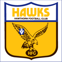
1976
Hawthorn's first official logo featured a gold shield with a 'Flying Hawk' holding a brown football with 'HFC' in its talons. Initially designed with a royal blue border around the text section.
Read More
1980
The royal blue border was replaced with a brown border as VFL clubs were no longer required to use the blue border design, marking a shift towards club-specific branding.
Read More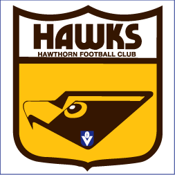
1983
The revolutionary "Hawk Head" design by Velda Ellis was introduced as part of "The new force of the 80s" campaign. Uniquely featured only the head, unlike other VFL clubs.
Read More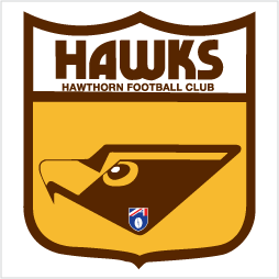
1990
The iconic Hawk Head design continued with updated AFL branding, representing an era that brought five premierships and eight grand finals in 15 years.
Read More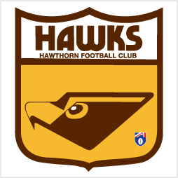
1994
A subtle redesign moved the AFL logo to the corner while maintaining the popular Hawk Head that had become synonymous with the club's success.
Read More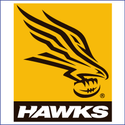
1997
The 'New Hawks' launched with a modern Flying Hawk design and 'Proud, Passionate and Paid Up' campaign, driving membership from it's lowest point to 30,000+ in two years.
Read More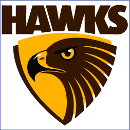
2008
Launched by President Jeff Kennett, this Cato Purnell Partners design returned to the Hawk Head style, emphasizing determination and pride through the hawk's eye and beak.
Read More
2025
Inspired by the club's 1925 iteration, this centenary logo features the iconic HFC monogram. Designed to commemorate 100 years in the VFL/AFL competition.
Read More